Sunday, April 29, 2007
Thursday, April 26, 2007
Entourage Elements
These are entourage elements, created in Photoshop, for use in architectural renderings as scale figures or background pieces. They are posted on the AAA server, in the Entourage Zoo. Steal 'em.
Skateboarder Human Form: skateboarder.png
Skateboarder (Opaque) Human Form: skateboarder-opaque.png
Range Rover Object: rangerover.png
Range Rover (Opaque) Object: rangerover-opaque.png![]()
City Skyline Background: cityskyline.png (It has a clear background, I don't know why it shows up as black here.)
Mountainous Background: mountains.png
Posted by
Stephen
at
16:58
1 comments
![]()
Tuesday, April 24, 2007
New Orleans Climate Layout
This is part of a site study for my Architecture 284 studio focusing on the climatic and geographical features of New Orleans. I'm pretty happy with it; I take it as evidence that I can be pleased with my work if I'm actually allotted enough time to do it well. But, you know, feel free to hate on it. 


Posted by
Stephen
at
23:15
0
comments
![]()
Sunday, April 22, 2007
Illustrator Section
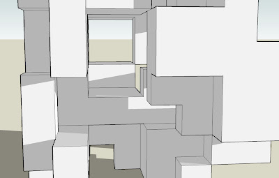
This project was an exercise in defining space by manipulating the same kit of parts used in Project 2. We were allowed to manipulate two planes of each individual object, giving us the opportunity to maximize their space-making qualities. Once the space was defined, we focused on portraying it through use of the section in particular. By utilizing SketchUp's various export capabilities and Adobe Illustrator, I was able to to develop a dynamic section cut to convey the structural and spatial qualities of my design.
Illustrator Section
SketchUp Section
Plan
Elevation.jpg)
Immersive View #1 (3-Point Perspective)
Immersive View #2
Posted by
Stephen
at
22:50
1 comments
![]()
Monday, April 16, 2007
Spatial Variations
For assignment 2, we were provided with a kit of three-dimensional parts and given the task of creating one centralized composition, a distributed (decentralized) composition and a hybrid composition, using only the pieces provided to us. It was also requested that we pay particular attention to the space defined by the parts, not just the form of the parts themselves.
My three solutions are posted below.
Kit of parts:
Posted by
Stephen
at
13:59
0
comments
![]()
Saturday, April 14, 2007
Centralized Composition
This is my centralized composition. The implied planes created by the 4 large cubes and all 10 of the smaller cubes share a common center in the middle of the composition. Also, the transparent box and the long, skinny box contained inside the transparent box each bisect this common center, unifying the solution from a single point. This results in a form that is symmetrical on three axes, giving it a centralized character.
Isometric View
Plan
Elevation
Human Perspective
Immersive View #1
Immersive View #2
Posted by
Stephen
at
12:01
0
comments
![]()
Decentralized Composition
This is my solution to the decentralized composition. My goal here was to create a very linear design, one in which there was no discernible center, only evenly spaced forms. I achieved this by arranging the small cubes in grids and stacking the other pieces on top of them. The result is simple, but I feel it effectively solves the problem. 
Isometric View
Plan
Elevation
Human Perspective
Immersive View #1
Immersive View #2
Posted by
Stephen
at
11:59
0
comments
![]()
Hybrid Composition
Finally, here is my hybrid composition. To achieve both distributive and centralized qualities, I combined the two approaches I used on the other two solutions in this assignment. I first created a distributed form with the cubes, then manipulated it to be symmetrical on three axes. The result is a hybrid (go figure) of the centralized and decentralized arrangements, sharing characteristics of each. 
Isometric View
Plan
Elevation
Human Perspective
Immersive View #1
Immersive View #2
Posted by
Stephen
at
11:54
0
comments
![]()
Sunday, April 8, 2007
Subtractive Cube

Isometric View
Elevation #1
Elevation #2
Immersive View #1
Immersive View #2
This form is the "Subtractive Cube." I began with a solid cube and removed material from it to define a space within. This was a bit harder for me, as I was forced to work through the existing form to create the space I intended. Part of this is due to SketchUp, because some of the annoying quirks in the program wouldn't allow me to do exactly what I wanted to do. I did find it useful to explore both methods of defining space, however, as each requires a different mental approach to develop an effective design.
Posted by
Stephen
at
23:58
0
comments
![]()
Additive Cube

Isometric View
Elevation #1
Elevation #2
Immersive View #1
Immersive View #2
This form is the "Additive Cube", created by adding cubes upon each other to define a space. I found this approach to be much more open-ended and easier than the subtractive method. I could more easily take this where I wanted to go, rather than "whittling" away on a previously existing object.
Posted by
Stephen
at
23:55
1 comments
![]()

